One of the most sought-after trends of recent years: let’s find out how to use this philosophy also in furnishing your home.
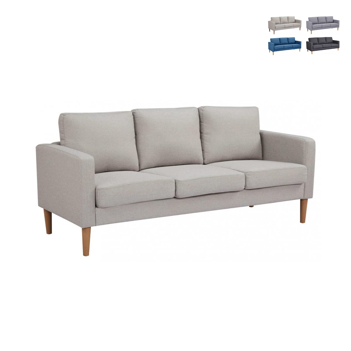
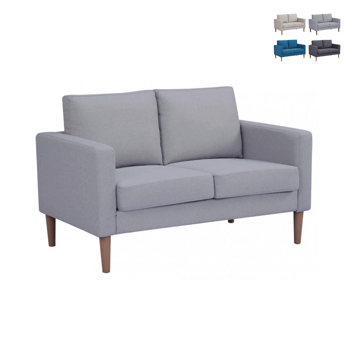
Do you think it is a coincidence that ProduceShop gives you so much freedom in choosing the colours of your furniture? Then let’s see how you can take advantage of it by using Armocromia methods.
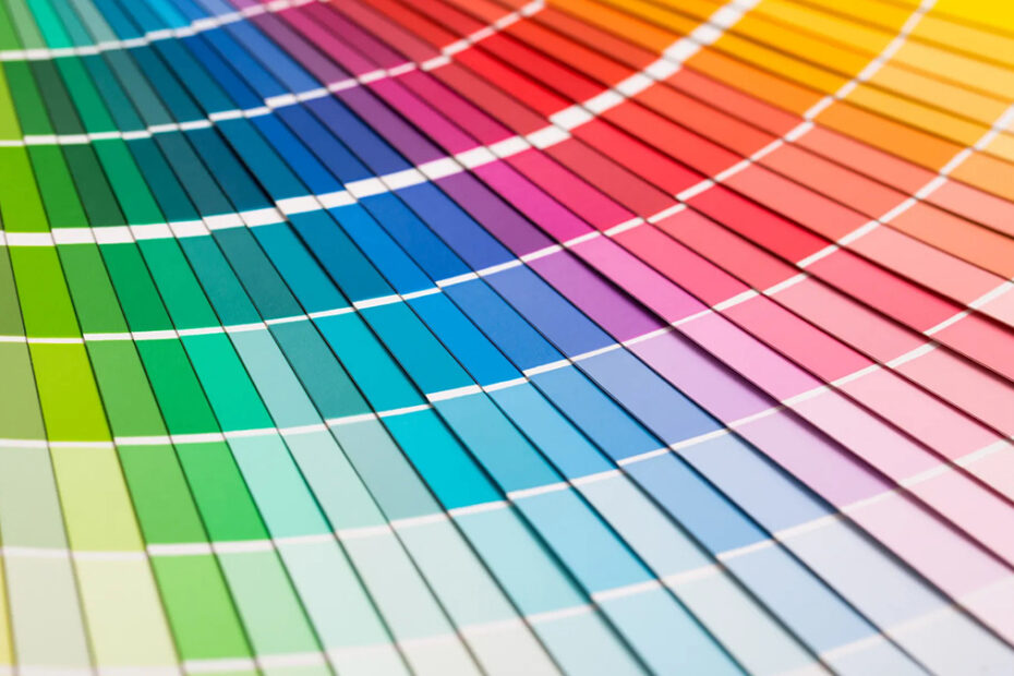
Armocromia (Seasonal Color Analysis) is a discipline that, through the analysis of colours and palettes, helps create harmony between them and the person; born around the 1930s, it has been gaining a foothold in the world of make-up since around 2019. The idea is to find the right combinations of colours, tones, intensities, which enhance the person, creating a harmonious and pleasing ensemble.
But is this something that only applies to make-up and fashion?
Obviously not, otherwise we wouldn’t be here talking about it. Taking over the reins of the discipline, interior designers in recent times have been trying to combine furniture and home decor solutions following its dictates.
ProduceShop, of course, has not been outdone; if, ever since we started dealing with furniture, an eye for colour and combinations has always been a priority, our interior designer service has given a boost to this good practice. So let’s discover together some interesting tips on how to choose colours for the home with armocromia (and good taste, of course).

Why using armocromia at home?
A sensibly furnished home, in which everything follows a plan (not necessarily an order, but at least an idea), has merits and benefits; if to this basic idea we add a choice of colours that is the result of reflection, the results can only be enormously positive.
Basically, a conscious and reasoned choice of colours can improve the perception of spaces; by playing with combinations, contrasts, tone scales and, above all, with light, even a small room could seem much larger. But that’s not all: colour-calculated geometries create stunning optical effects, giving domestic architecture a definitely more interesting flare.
Moreover, the right choice of colours also has influences on our mood that should not be ignored. The fact that certain colour combinations have specific effects on our nervous system is scientifically established; it is thanks to the study of armocromia that these effects have been studied to create colour cocktails specifically designed to make us feel better, always and in every room of the house.
Relaxation VS Energy
The basic idea is that different colour tones stimulate two basic reactions: extreme relaxation and irrepressible energy.
It goes without saying that, depending on the room we are in, it is always better to stimulate one or the other reaction. If, for example, in the bedroom and bathroom one is looking for a moment of relaxation, and mind and body need to unwind and rest, in rooms such as the living room or study, but also the kitchen at times, the frenzy and the urge to get things done must be constantly stimulated. Working with armocromia to achieve this is among the most interesting activities in interior decoration.
Building a style
Finally, this approach is also chosen because, playfully, our home must follow a style; it can be a classic style, something traditional and established, or something original and personal.
Drawing this style on colours is one of the ways to go; doing it in such a way as to create combinations that tell who we are, how we live, is something that goes beyond simply furnishing. We are talking about creating our own style, even personalising a single element of a piece of furniture seen on a website or in a magazine; the important thing is to always feel at home, and to make our guests feel immersed in an original and harmonious environment.
How it works
In its basic application (make-up and fashion), armocromia aims to distinguish ‘friendly’ colours from ‘enemy’ colours. The former are all those colours that enhance the person wearing them (or, to use our language, the room they decorate), while the latter debase the result.
Colours are chosen on the basis of shades and intensity; we therefore subdivide them into warm colours and cold colours as regards the first differentiation, and into vivid and light colours as regards the second.
Since it originated as a fashion-related concept, the various colour possibilities/combinations are divided according to the four seasons, and each is linked to a specific hue and intensity:
- spring: warm and light shades
- summer: cold and light shades
- autumn: warm and vivid shades
- Winter: cool and vivid shades
If we apply the concept to the home (but, as we shall see, it also applies to an office), we can then, by choosing from a range of colours, make these combinations:
| Seasons | Colors | Rooms | |
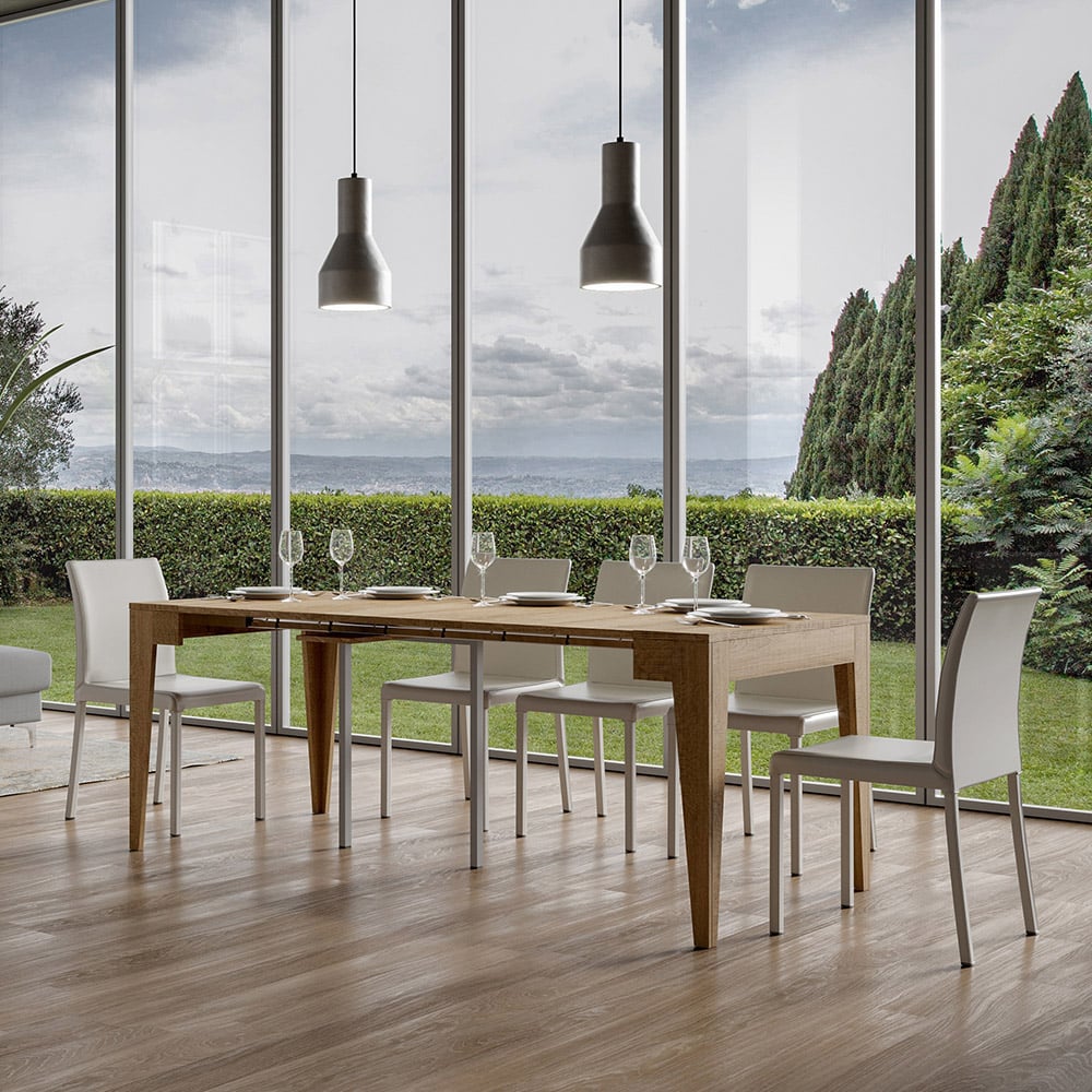
| Spring | Beige, yellow, natural wood, green, coral red | Kitchen | |
| Summer | Dove grey, light blue, pink, lilac, mint (all pastel) | Camera da Letto | |
| Autumn | Mustard, olive green, red, copper, brown | Salotto | |
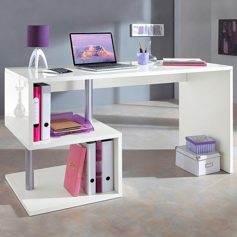
| Winter | Black, grey, fuchsia, lime, electric blue, garnet | Office |
Of course, ours are suggestions, advice given based on what our customers tell us, and what our interior design team has evaluated over time. However, there are additional tricks that can be implemented, so let’s continue.
Armocromia in interior design: 5 useful tips

-
Not only for home
The home is not the only place where you can have fun decorating. Think of an office, a club or a shop; here too the right choice of furniture, colours, tones and combinations is important. Indeed, when it comes to commercial activities, the choice of exact colours becomes a marketing matter, and can reflect positively or negatively on customer behaviour. Therefore, do not ignore colour harmony under any circumstances, even if it is only a small room.
-
Play with shades and intensity
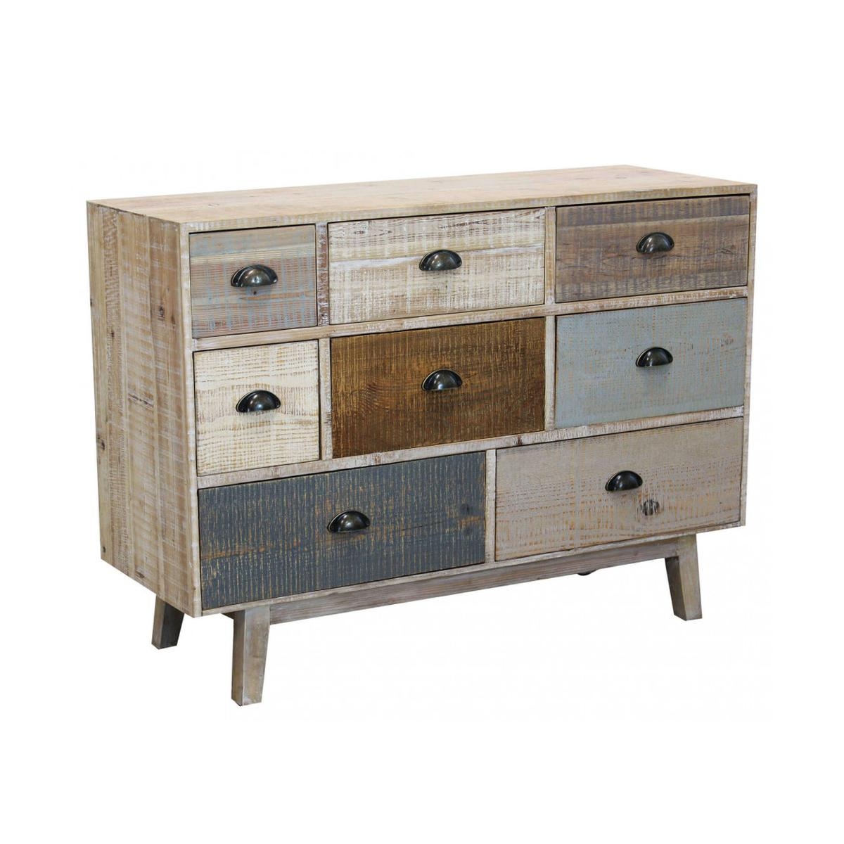
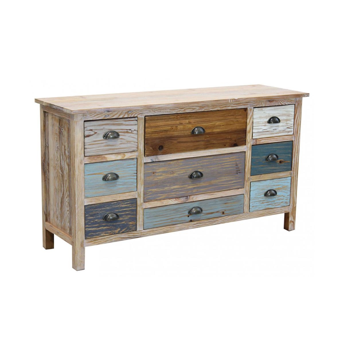
If you want to stick to a reduced palette, you have to look for variation in a narrower range; a room full of colours may be fun if we are talking about children, or a playroom, but it is a bit heavy on the colour harmony level. If your chosen palette consists of 3 or 4 colours, play with the different shades and intensities of these, obviously adapting to the ‘seasonal’ spirit of the ensemble you are going to create.
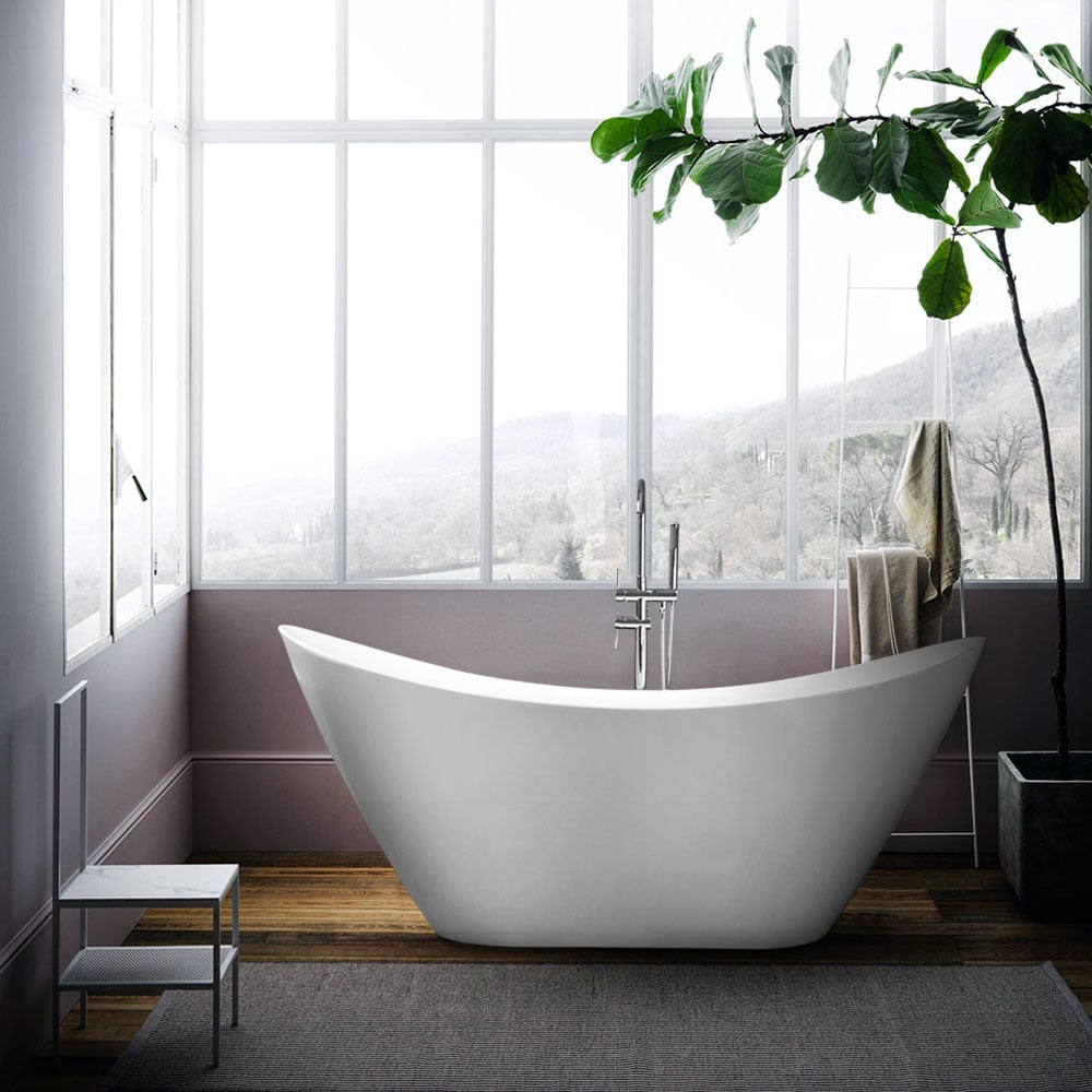
Freestanding Oval Freestanding Bathtub Installation Design Siro -
Starting with the right colour…
An important tip: do not enter the house with buckets and buckets of paint. Ideally, when you paint your house, and when you then decorate according to what you have planned in the beginning, it is best to start with a neutral situation. A white (not necessarily anonymous, even a more interesting shade such as an eggshell or sugar paper), a grey, can be perfect because, as you gradually juxtapose different shades of colours more present, you will notice the effect without too much contrast to disturb you. Remember, neutral base, but always light.
-
…and don’t keep just one
Once you have decided on the spirit of the room, you can use the whole palette but, for some rooms, we recommend playing on the contrast between a dominant colour and a complementary one. The perfect combination that swings between only two choices, perhaps in different keys of tone and intensity, can in the end offer a very striking and striking effect, especially if the room is more contained and less dispersed.
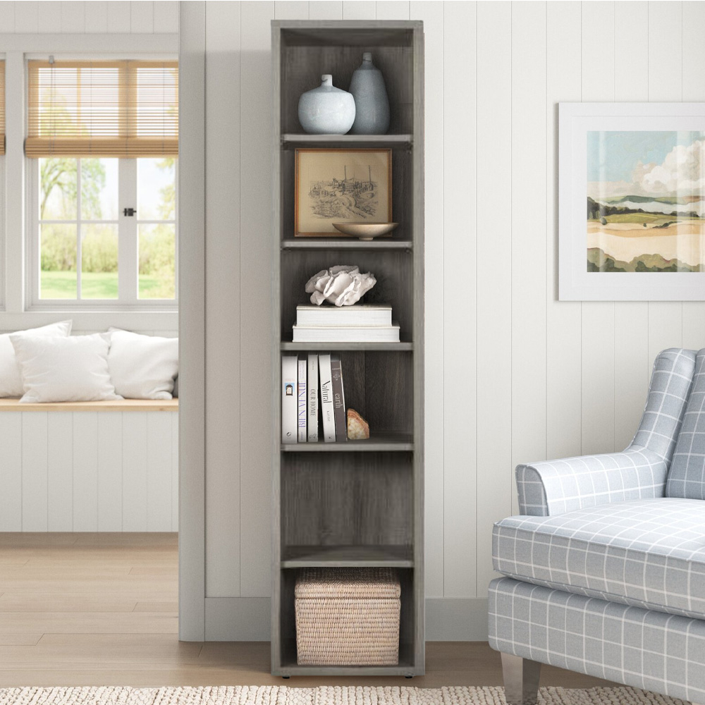
Narrow Modular Bookcase 6 Shelves Grey For Home & Office Slim -
The importance of light
Never forget to consider light; both ambient and artificial light must be taken into account well before starting to decorate in colour, but already during the design phase. Remember that the arrangement and choice of colours in itself, as we have already mentioned, can arrange different and interesting plays on perspective; be careful not to spoil what you have done with the wrong lamp (too big or small, warm or cold, far or near), or by arranging the furniture without taking into account windows and skylights. Last hint: light often changes certain colours significantly.
That’s what you were looking for right? If so, why don’t you tell us yours too? Now that you know everything (or at any rate, the essentials) about Armocromia and how to use it in interior design, all you have to do is take a careful tour of the ProduceShop catalogue. Palettes in hand and off to match!